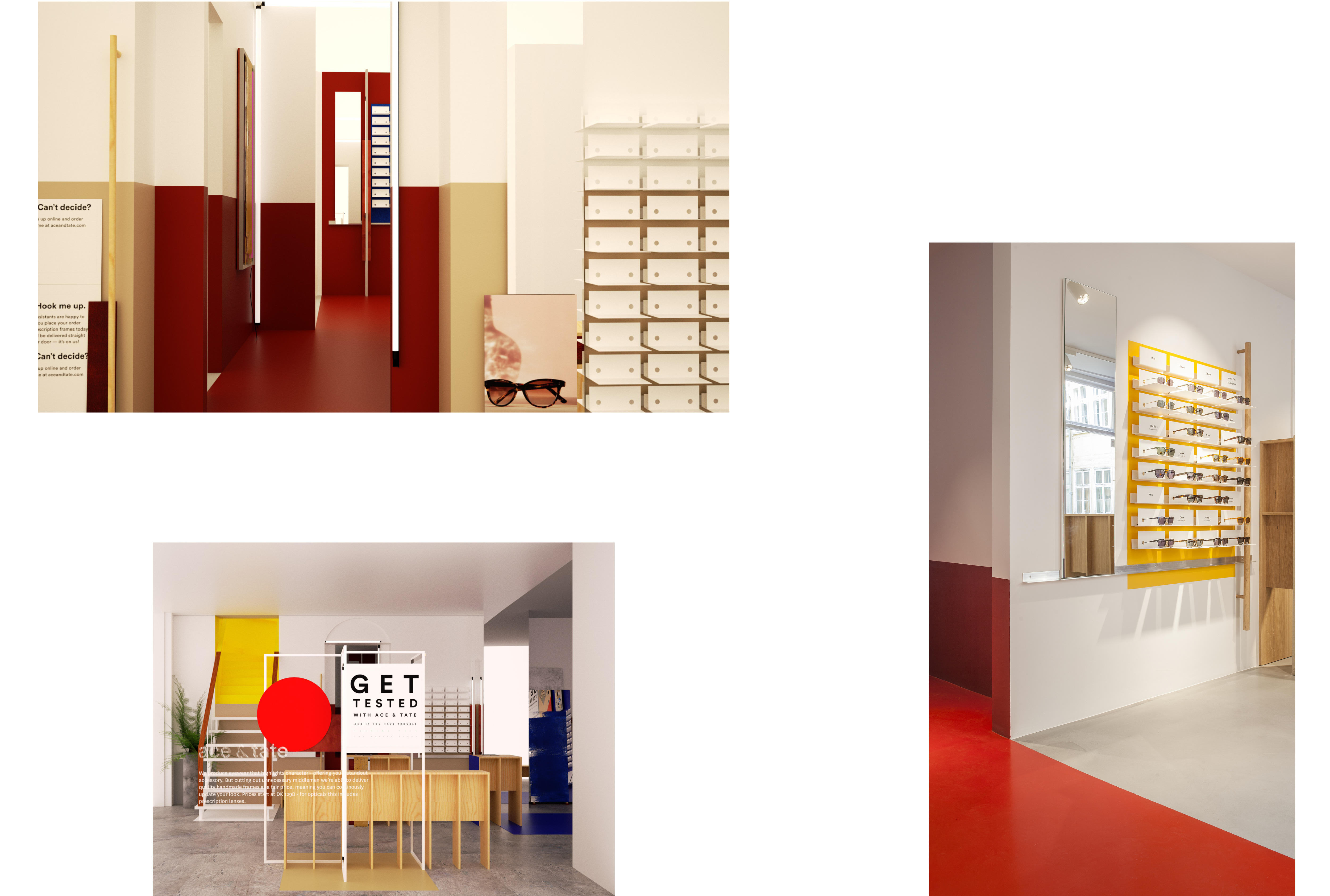
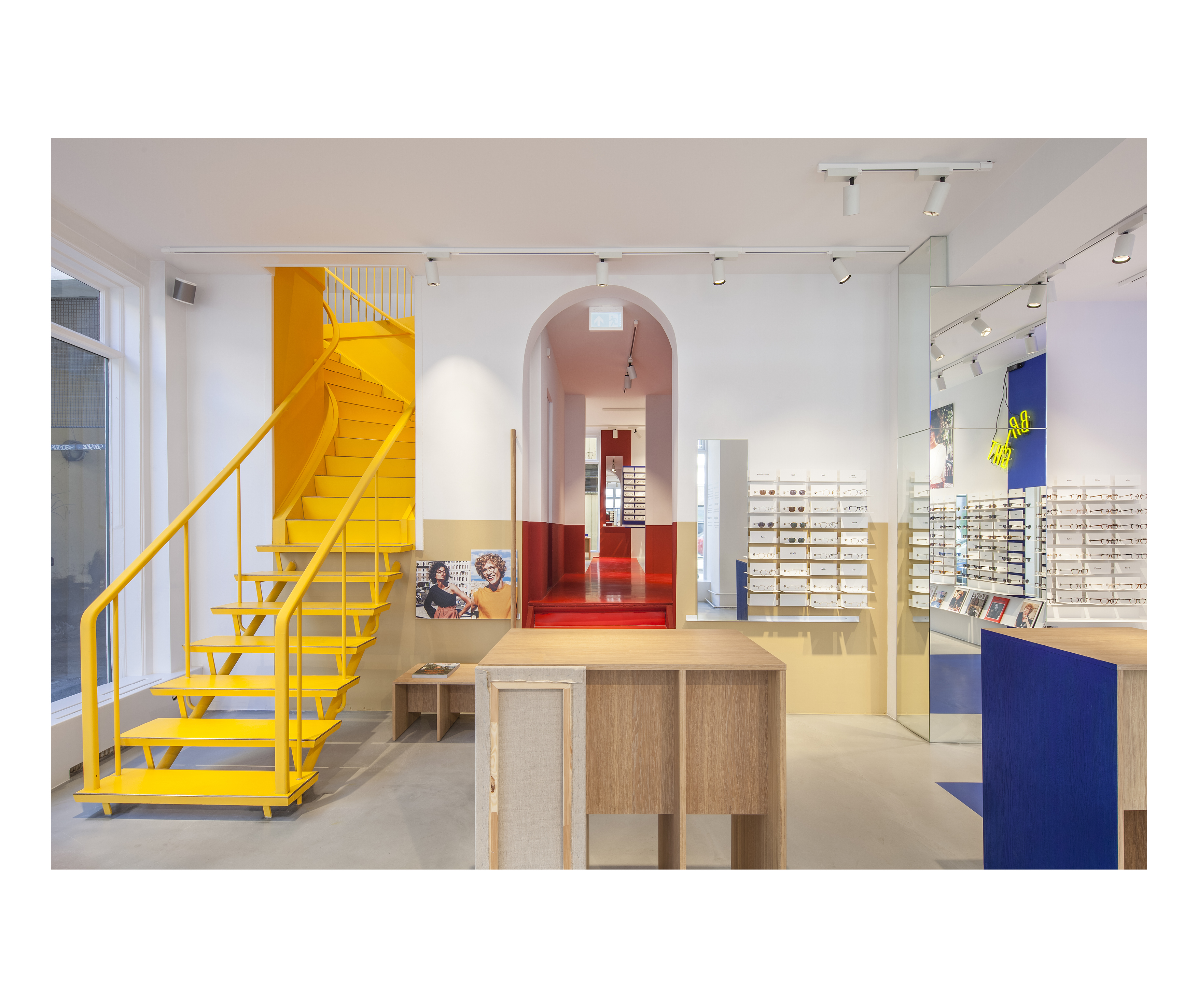
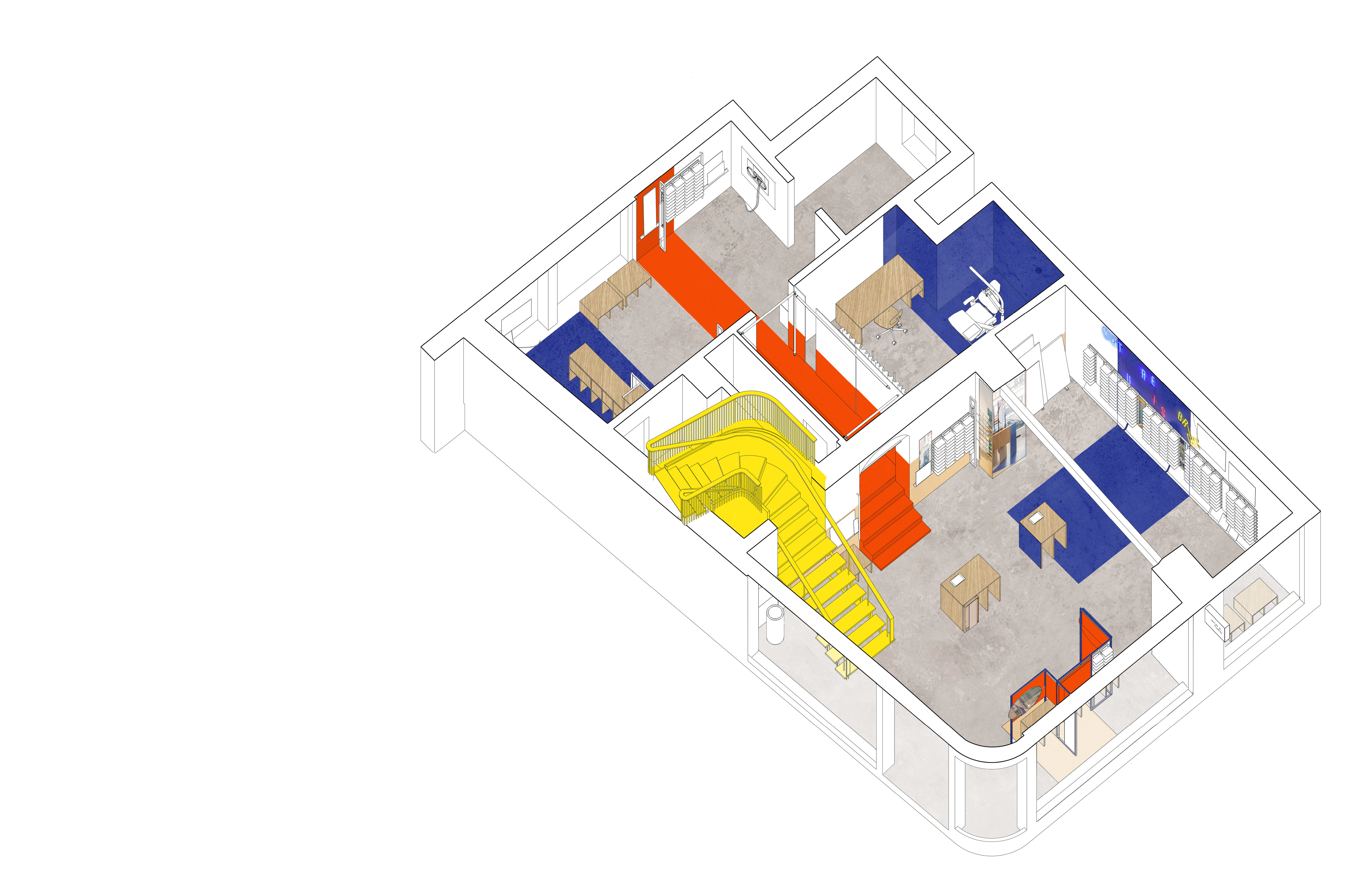
Expanding the visual identity
For the eye-wear brand Ace & Tate, we wanted to express and expand the visual identity of the brand, by creating a subtle experience of entering an artist space when visiting the store. On a white and clean background, we have designed a spatial colour-combination, adding a play-full aesthetic, and making the products stand out from the walls. We have designed different try-out stands, where costumers can try the different products with a feeling of standing in a rather private zone. They are made of oak, adding a tactile and warm feeling to the space, while their blue frames elaborate the spatial, graphic language of the space.